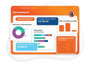
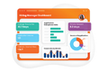


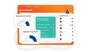
Visualisations
Whether you choose charts, gauges or SnapStats – your dashboards are fully interactive; just click to see the candidates, contacts, vacancies and activities behind the numbers...giving you actionable insights to make successful decisions. Eploy dashboards are much more than just charts and reports - they are also the ideal tool to navigate around the system, completely personalised to your way of working.
- Eploy Dashboards
SnapStats
SnapStats help you focus on a single metric, then drill-in to see the underlying data.
- Eploy Dashboards
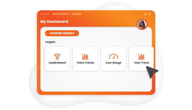
Team & User Trends
Team and user trends display performance against targets, keeping everyone on track and highlighting potential problem areas.
- Eploy Dashboards
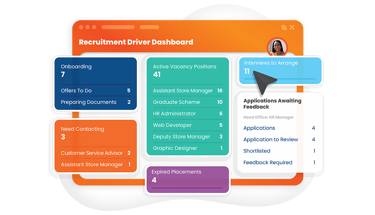
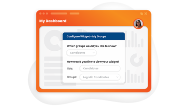
My Groups & Queries
Keep all your favourite searches, groups and queries to hand by embedding shortcuts into your dashboards.
- Eploy Dashboards
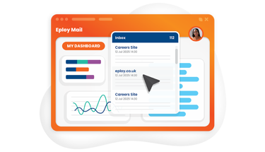
EployMail
Dashboards aren't just for charts, they're your personal recruitment hompeage too, add the email widget and access your emails direct from your dashboard.
- Eploy Dashboards
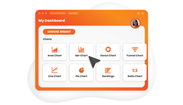
Multiple Chart Types
Choose from multiple charts to display your metrics, including: bar, line, area, doughnut, pie and rankings.
- Eploy Dashboards
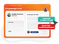
Leaderboards & Gauges
Add gamification to your recruitment! - with leaderboards for team and individual performance help to inspire your teams to success. Even show the top three medalists to see who's going for gold!
- Eploy Dashboards
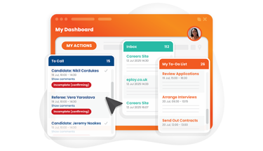
Action Lists
Get quick access to all of your tasks and activities direct from your dashboard.
- Eploy Dashboards
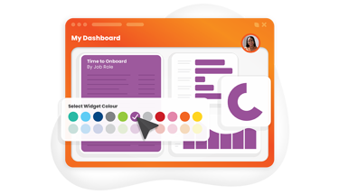
Colour coding
Colour code your dashbpoard visualisation with the colour palette.
More colours mean more flexibility for organising and colour coding your widgets, choose from bright colours for highlighting key data or softer pastel colours that are easy on the eye. It's your choice!
- Eploy Dashboards
Funnels
The Funnel widget is a great way to keep track of the progress of candidates/applications through your workflow processes. The Funnel chart can display both the number of applications at each stage and the percentage, and Eploy remembers the history of each application so that you can calculate your Full Funnel Throughput efficiency.
As well as displaying it as a funnel, you can opt to invert the order and display it as a pyramid chart.
- Eploy Dashboards
Ratios
Many Talent Acquisition KPIs are ratios, so we’ve included a Ratio Widget. it’s excellent for creating dashboards of your key recruitment metrics, like offer acceptance rates, workflow stage conversion rates and many more. You can display Ratio Widgets as a SnapStat for a quick ‘helicopter view’, as a bar chart to compare ratios between different criteria, or as a line chart - to plot changes in your ratios over time.

Achieve your Hire Purpose with Eploy
Transform your recruitment game! Book a live Eploy demo where we offer an immersive walkthrough of powerful features and seamless workflows. Elevate your hiring process today!
Further reading...
Explore Eploy's resources for the in-house recruitment and talent community.